
Interactive React cards
Browse expandable, hover-responsive and animated React cards with demos, editable source and installation links.
Cards 1–24 of 67
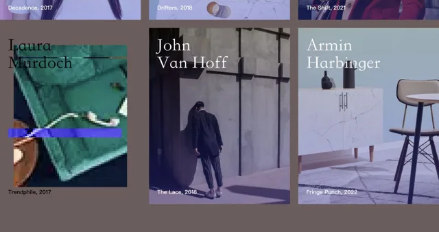
Glitch Perspective
Codrops
Holographic Card
Kraavon UI
ExpandOnHover vertical
Skiper UI
ExpandOnHover
Skiper UI
Border Beam
Magic UI
Shine Border
Magic UI
Glare Hover
Magic UI
Neon Gradient Card
Magic UI
Switchboard Card
Smooth UI
Tilt Card
Smooth UI
Stacking Cards
Fancy Components
Tilted Card
React Bits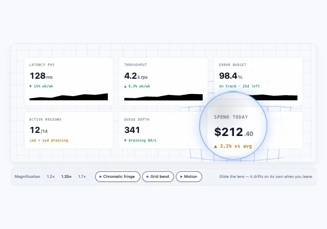
Lens Card
Motiq
Card Stack Deck
Motiq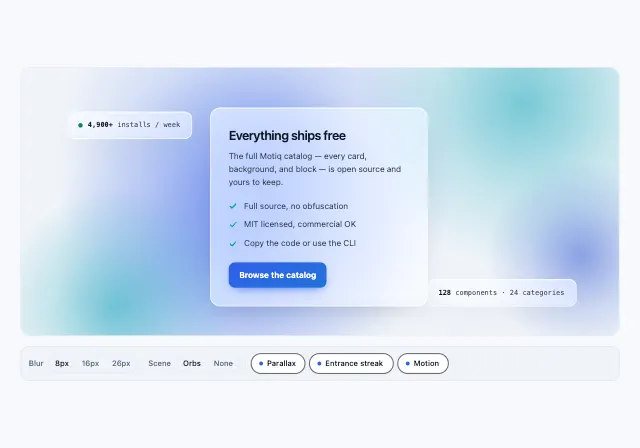
Glass Refraction Panel
Motiq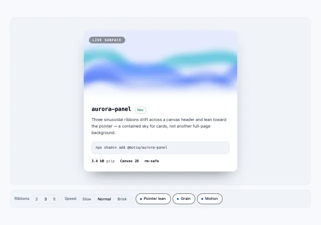
Aurora Panel
Motiq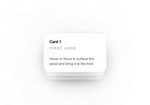
Animated Card Stack
UI TripleD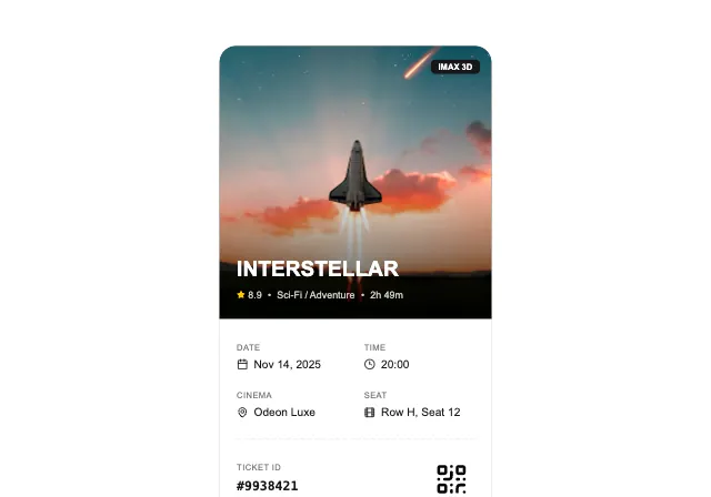
Cinema Ticket
UI TripleD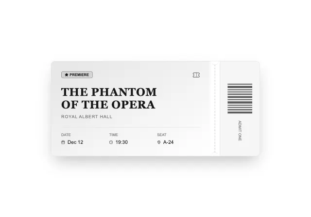
Theater Ticket
UI TripleD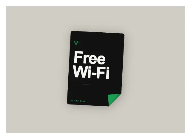
Peel to Scan
AI Canvas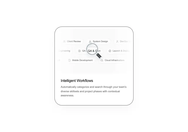
Magnified Bento
useLayouts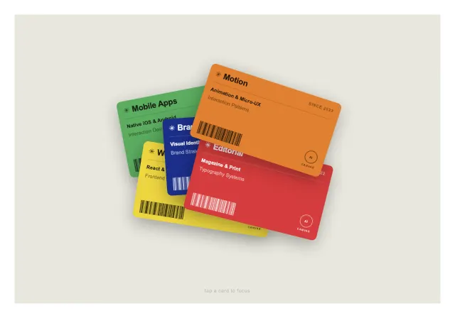
Label Cards
AI Canvas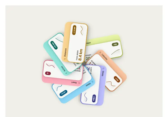
Radial Cards
AI Canvas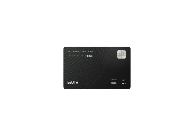
Card Folder
BE UIChoosing cards components
Design around the action inside the card
A card can navigate, expand or contain several controls. Decide which action the whole surface performs before adding hover movement or nested buttons.
Check the final interaction
Test long titles, missing images and real data. Check that keyboard focus exposes the same actions as hover and that nested controls do not trigger card navigation.
Last updated: .